As artists, our ultimate goal is to tell an engaging visual story through photography. The ability to accomplish this goal is dependent on the way we orchestrate our canvases. This is what composition is all about: it’s the process of visually organizing essential elements of an image through the deliberate framing of your camera. Composition anchors the human eye and enables photographers to direct the eyeballs of their viewers. In other words, the way our visual artistry is anesthetically received is dependant on how a scene is organized, framed and composed. This is why composition is a crucial ingredient to creating captivating photographs.
When many people think of composition, the first thing that pops into their head is “rules”: The rule of thirds, the rule of balance, etc. But in reality, there are no hard and fast ways of getting your images “right.” Instead, the knowledge of certain techniques and the use of personal discretion is really the rule at play here. Rather than a strategy set in stone, think of composition as a set of guidelines and suggestions.
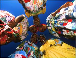
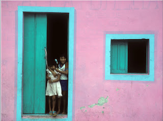
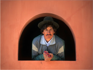
Framing- Framing has to do with the way you contain all the elements you wish to capture within your canvas. Essentially, good framing includes just the key elements of your image while omitting objects that detract from the larger picture. Keeping your horizons perfectly straight is a fundamental framing strategy that most should observe. Another important part of framing is finding the best location. This can mean getting closer to your subject, finding a unique perspective or zeroing in on a specific component of your shot (through lens selection). Additionally, experiment with the idea of frames within a frame.
 |
| Chase Guttman |
 |
| Victor Jorgensen |
 |
| Alfred Eisentaedt |
Perspective- The angle at which you portray a scene can dramatically impact its effectiveness. There is no better demonstration of the importance of perspective than the story of Victor Jorgensen. Victor’s name is relatively unknown, yet he snapped the shutter at the same time, and only a few feet from Alfred Eisenstaedt, the man accredited for the iconic V-J day image. Alfred’s image became well known and was widely published, while Victor’s photograph did not. The main reason was because Victor photographed the kissing couple from the side, capturing an unrecognizable backdrop. Eisentaedt on the other hand, caught the essence of the location, by shooting straight at the couple and allowing for a view down the avenue to Times Square.
 |
| Peter Guttman |
“Rule” of Thirds- The rule of thirds is based on the idea of a photo being divided into three imaginary horizontal and vertical sectors. By placing a subject along the lines of these sectors, you create more alluring imagery because it creates visual intrigue, as the eye naturally is drawn to one of the sections. You can read more about it here.
 |
| Peter Guttman |
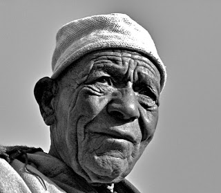
Filling the Frame- When shooting portraits, filling the frame can be a great tool for better compositions. This is because it allows your viewer to develop a more intimate connection with your subject. For ideal composition, negative space (which is an empty visual region) should be used artistically. However, when negative space becomes superfluous you begin wasting valuable image "real estate."
 |
| Chase Guttman |
Balance- To create a balance photograph, your image should have strong points of interest, or focal points (this could be attractive color, pleasing lighting, an interesting subject, etc.), on both sides. Experiment with the interplay of light and color to help ensure balance on both sides of the frame. The end result is a equally pleasing photograph on both sides of the frame.
 |
| Chase Guttman |
Spacing- On the contrary to the idea of filling the frame, spacing can be effective too. It can help you highlight the elements crucial to your story and create a type of separation between your subject and your viewer.
 |
| Peter Guttman |
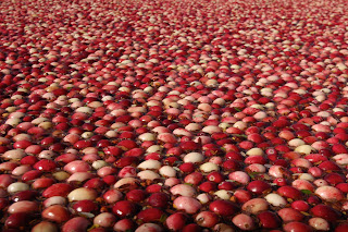
Repetition- You can use patterns in two unique ways: either keeping a pattern consistent or undermining a pattern by putting something out of place. The ultimate goal with patterns is to trick the eye into seeing more than what is really present inducing an imaginative feel (for this, using a telephoto lens can be helpful). In some cases, patterns can serve as a visual line from the foreground to the background, exciting the eye to inspect every inch of the composition. On the other hand, having an out of place item in the middle of an otherwise consistent pattern adds contrast and interest to your image.
 |
| Chase Guttman |
Symmetry- Symmetry is often an effective method of composing your image because it awes the eye (by making the eye wander all across an image, which is pleasing to the mind of your viewer). Symmetry also can echo your scene, giving emphasis to the story you're trying to tell.
 |
| Peter Guttman |
Leading Lines- Using naturally occurring converging, diagonal, horizontal, and vertical lines in your photographs makes for an interesting composition. Lines direct (or lead) traffic for your viewers' eye. This helps your viewer focus on the key points of the image and can also add an amusing component to your shot.
 |
| Chase Guttman |
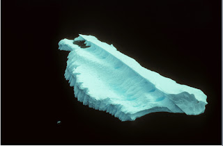
Simplicity- Simplistic framing can often times be the most artistic way to shoot, because when concentrating on basic elements your story can be told successfully without any other distractions. To best accomplish this you must have plainly colored backdrops (generally, black is the best), and subjects that strongly contrast with the clean background. Depth of field can also come into play here.
 |
| Peter Guttman |
|
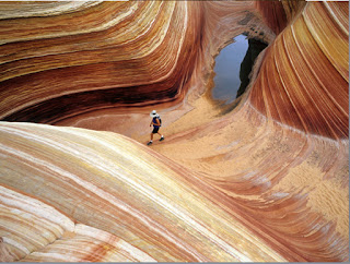
Texture- Texture is the incorporation of a unique surface to an image. Texture helps your images come alive, causing a two-dimensional photograph to have a three-dimensional look by adding a sense of depth- a dimension that is otherwise not seen in photography. Texture makes your viewer feel like they are there, which promotes sensory exploration.
 |
| Peter Guttman |
What Are The Main Things That Should Affect My Composition?
-Color- Rich and vibrant colors have the power to fortifying the impact of your image and grab your viewer emotionally. This relates to composition because the positioning of color deeply influences the appeal of your focal point(s).
-Lighting- Lighting can help highlight important components of your image and make your story more visually engaging. Essentially, lighting should direct where you position yourself and the frame (because optimal lighting can add a great appeal to your imagery).
-Backgrounds- Backgrounds should influence the way in which you frame your photographs or utilize depth of field. Backdrops can accomplish one of two main things: they can either perpetuate the importance of your subject or add a sense of place to your story.
In conclusion, composition is one of the most essential, but multi-faceted parts of photography. By understanding what effects composition (color, lighting, backgrounds, etc.) and the various techniques involved in it, you can be on your way to better photography. But remember, while these ideas can be quite helpful, sticking to your gut is usually the best way to go.


